Global website rebuild.
ArcelorMittal is one of the world’s largest steel and mining businesses, supplying construction, automotive and infrastructure globally. Its corporate website no longer reflected the scale or complexity of the business
An outdated site that was difficult to manage and navigate
The corporate website was outdated and hard to run, placing strain on internal teams and creating reputational risk for a global, publicly listed organisation. At the same time, investors, customers and candidates struggled to find what they needed.
How people were really using the site
I started with the existing data to understand how people were using the site and where they were struggling. Google Analytics showed the hard numbers, while Microsoft Clarity added the behaviour behind them.
Eight teams with competing priorities
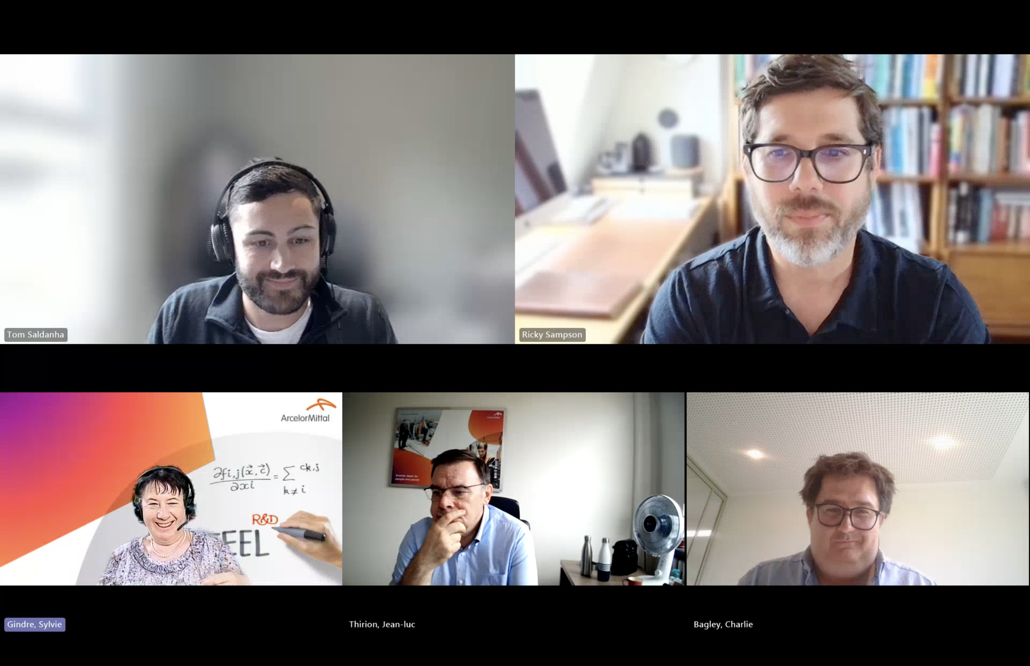
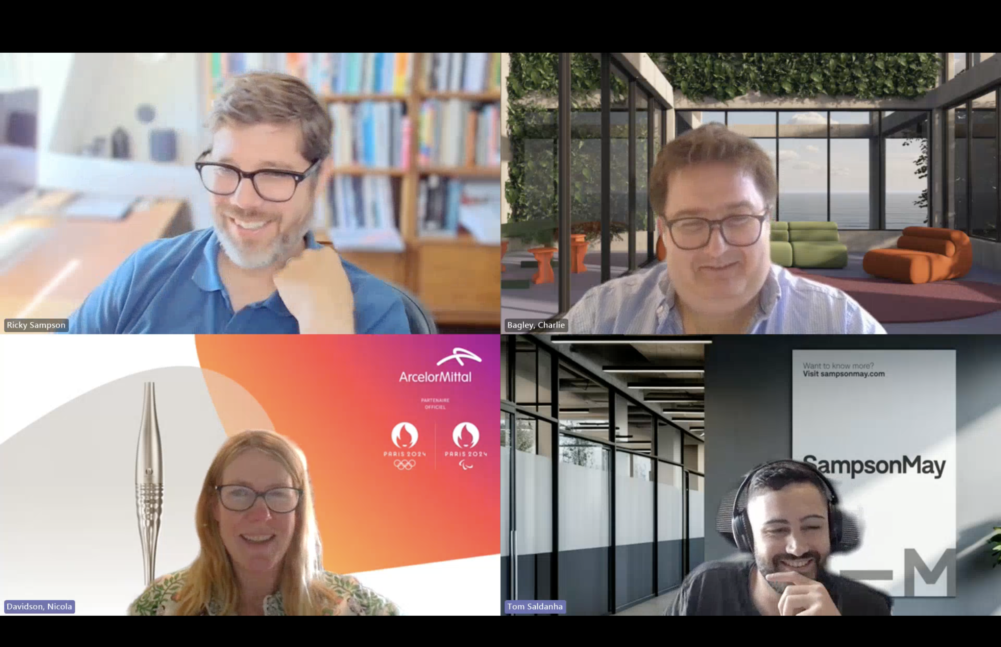
I ran 13 interviews across 8 teams, from the Chief Commercial Officer to the Heads of R&D, Corporate Communications, Talent, Sustainability and Investor Relations. This gave me a view across the business and helped balance competing priorities without allowing one department to dominate the direction.
Position ArcelorMittal as a strategic partner.
ArcelorMittal needed to be positioned as more than a steel supplier, with its expertise, technology and solutions showing the broader value it creates for customers.
Show that value more clearly through customer examples, flagship projects and evidence that helps decision-makers understand the commercial impact.
“Customers now invite us in for our knowledge, so we embed our engineers in their teams, focus on understanding the application, and sell the solutions that set us apart from a commodity supplier.”
Chief Commercial Officer
Finding the structure users expected
I ran a moderated open card sort with 7 participants to understand how they grouped and labelled content. The patterns helped shape a structure around users’ expectations rather than ArcelorMittal’s internal organisation.
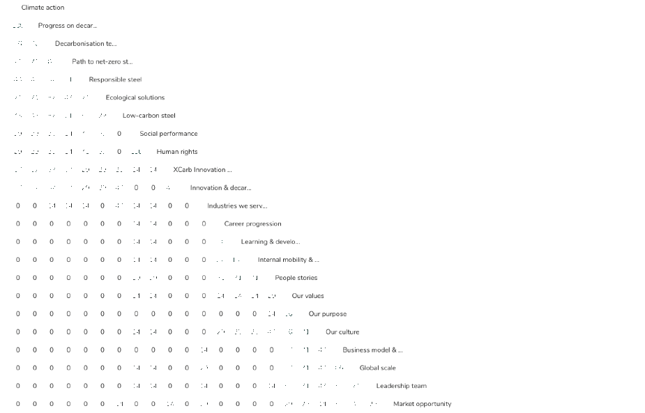
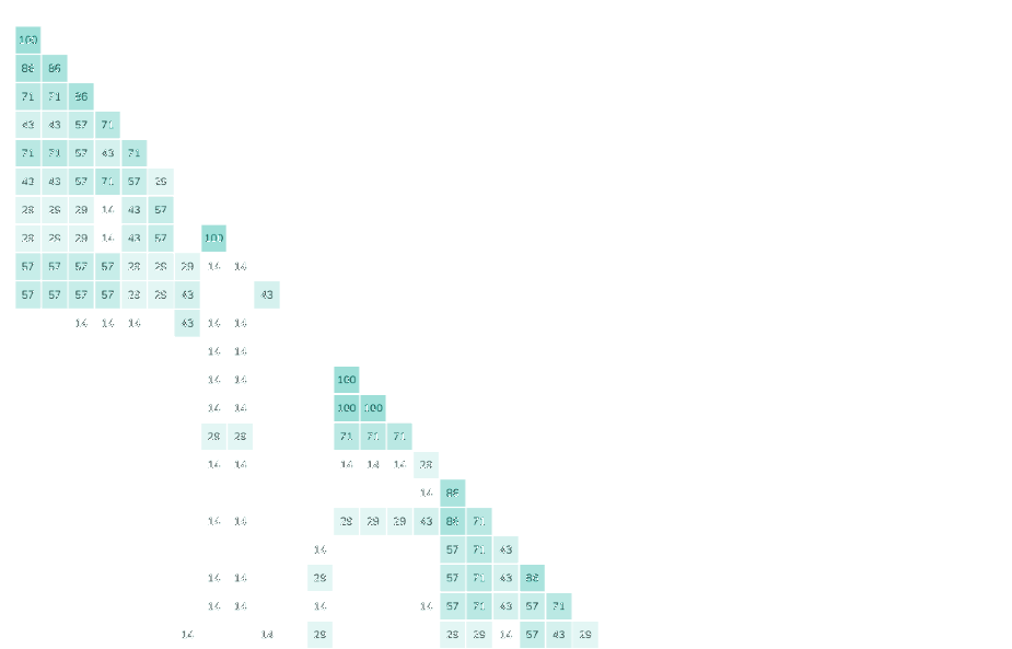
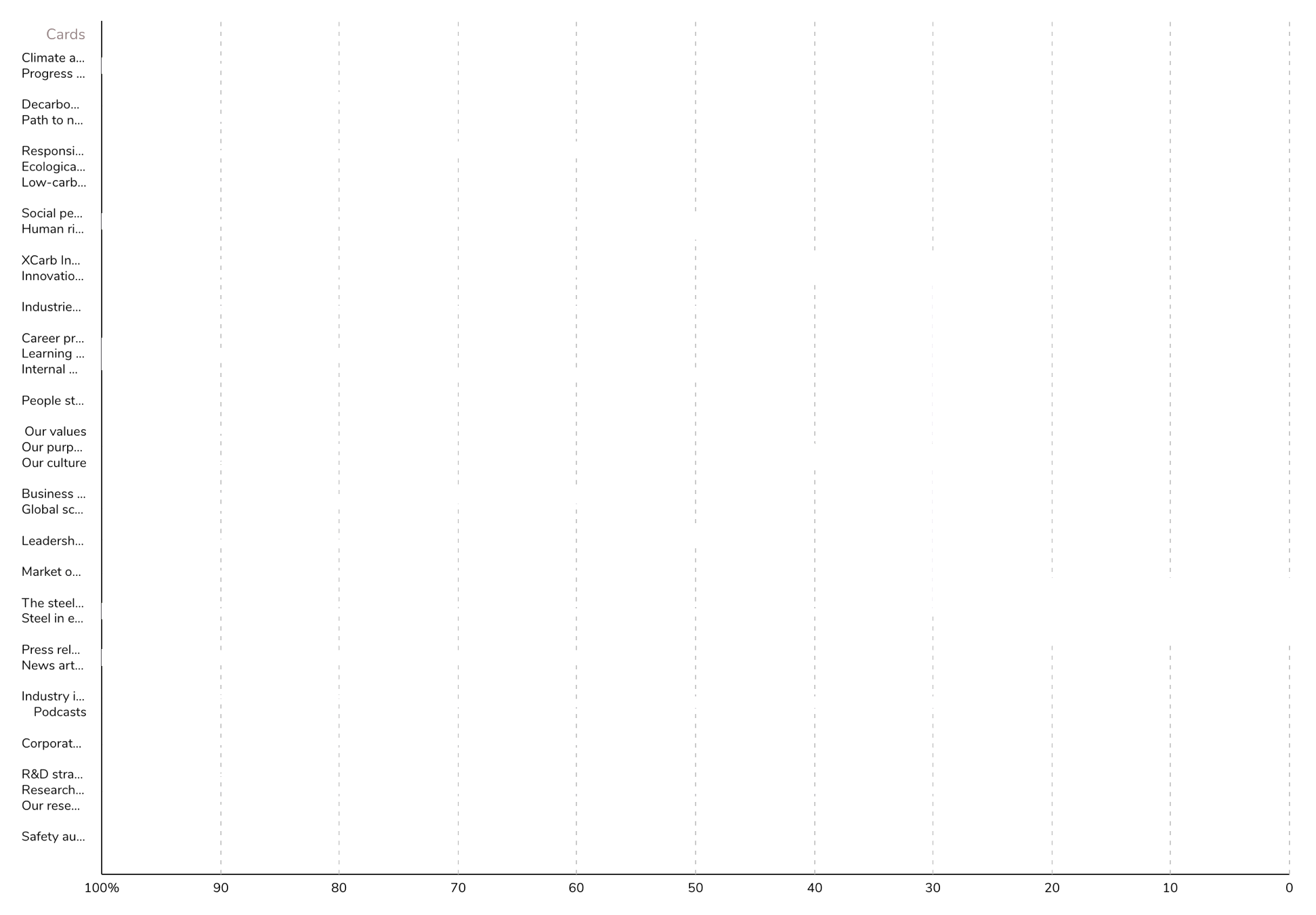
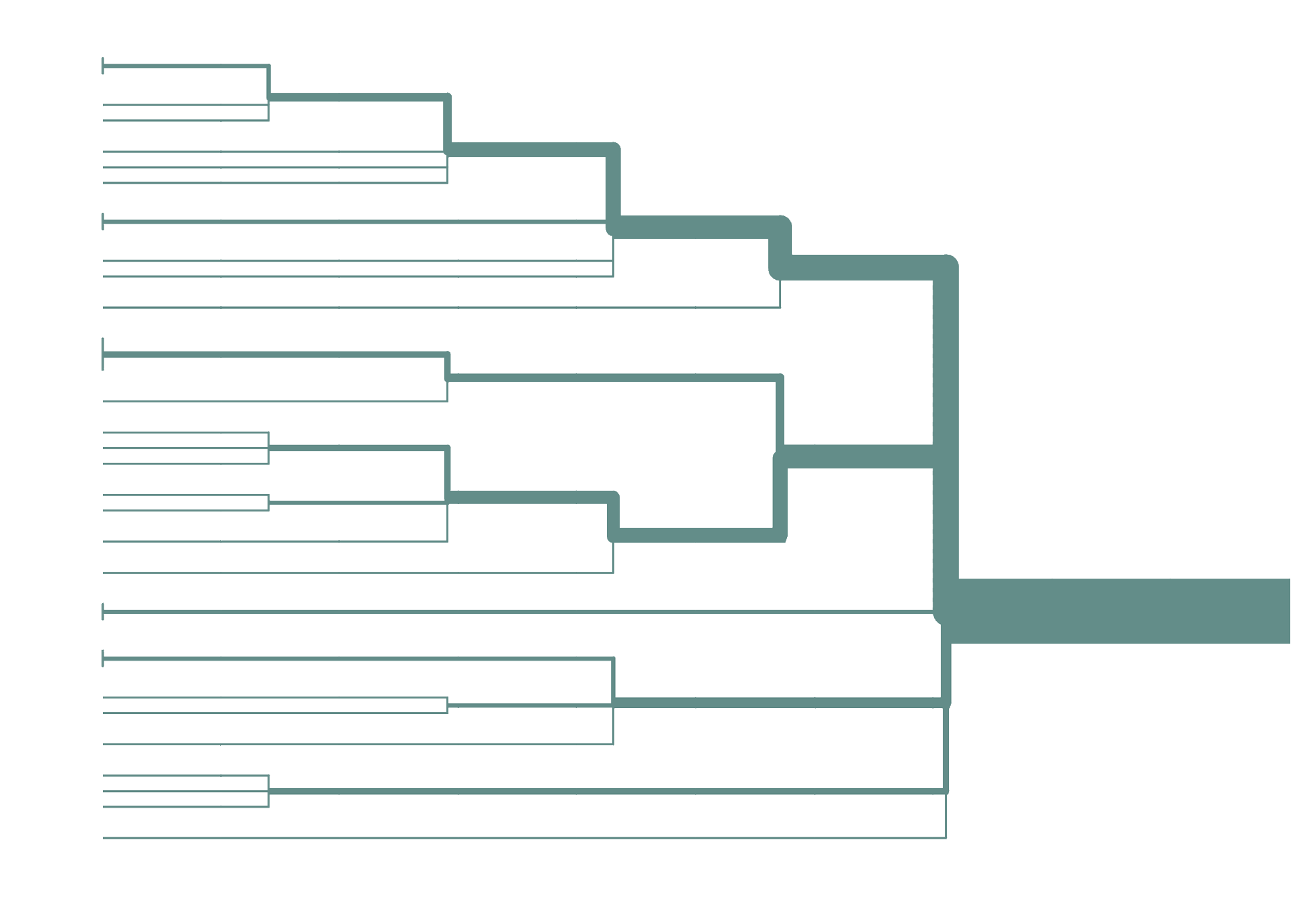
Shows how often participants grouped cards together, with darker cells indicating stronger agreement.
A simpler architecture built around how the business actually works
I combined the analytics, stakeholder interviews and open card sort into a revised information architecture. Duplicate and low-value content was removed, Innovation became a dedicated category and Climate action was folded into a leaner Sustainability section.
Testing the architecture before design began
I ran an unmoderated tree test with 7 participants across 14 tasks. Using text-only navigation meant the information architecture could be tested without the visual design influencing the results.
Turning the research into a shared blueprint
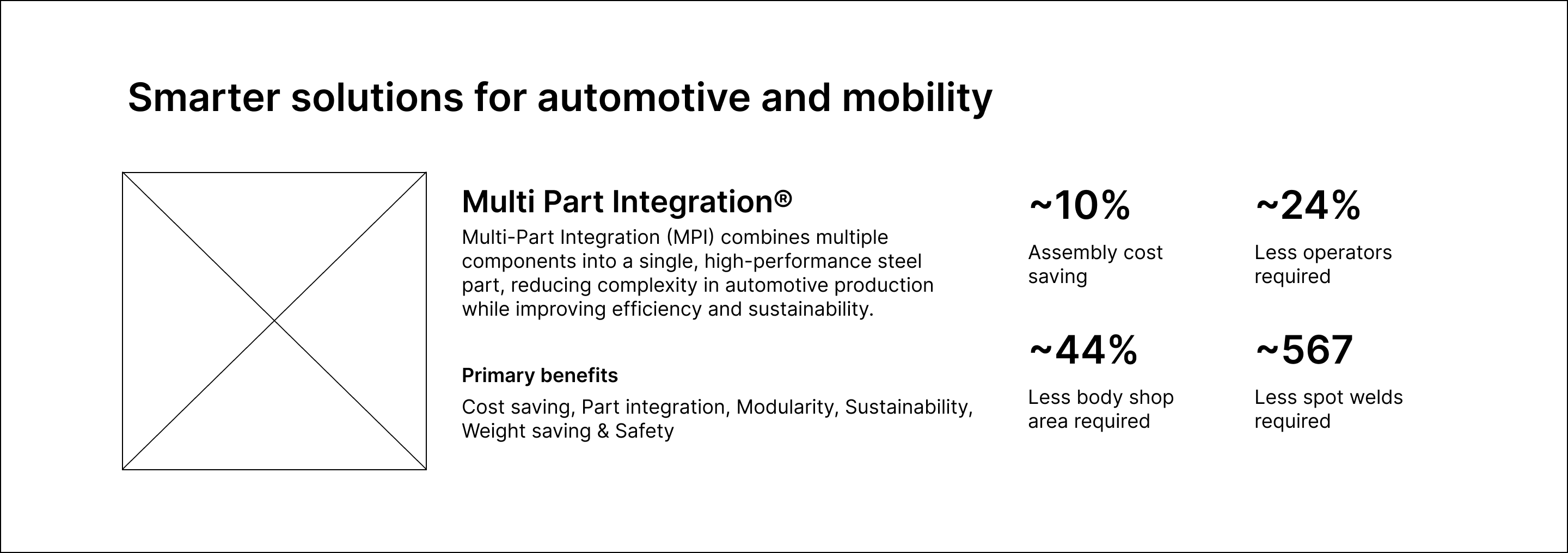
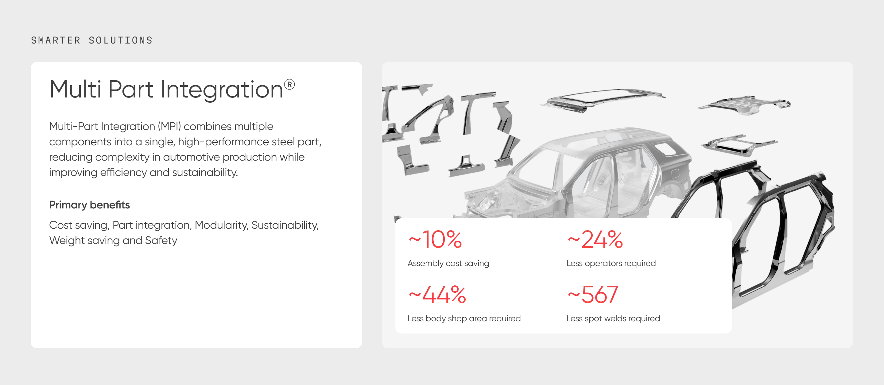
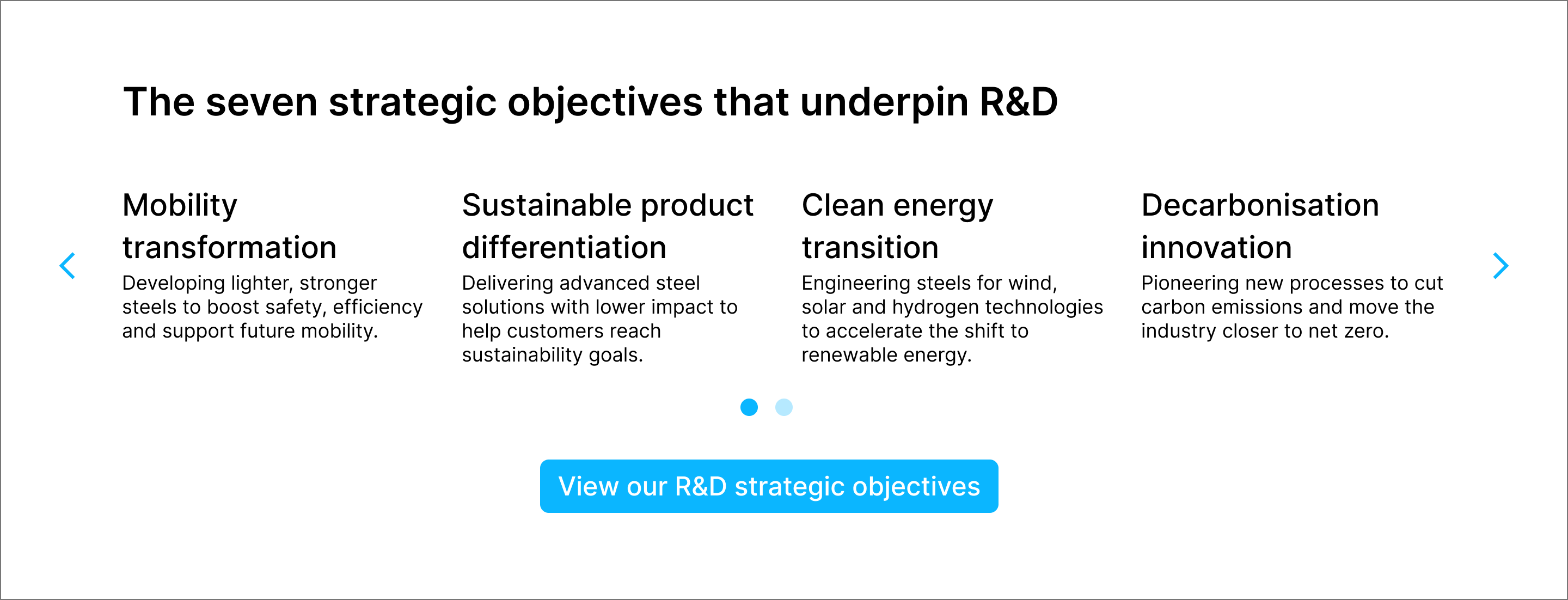
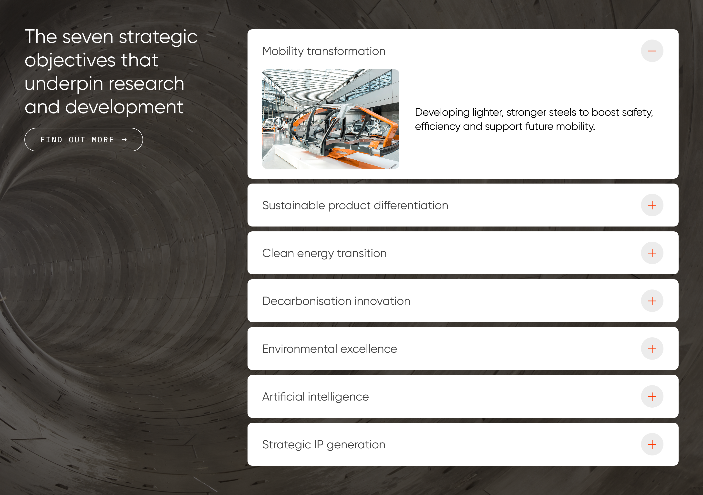
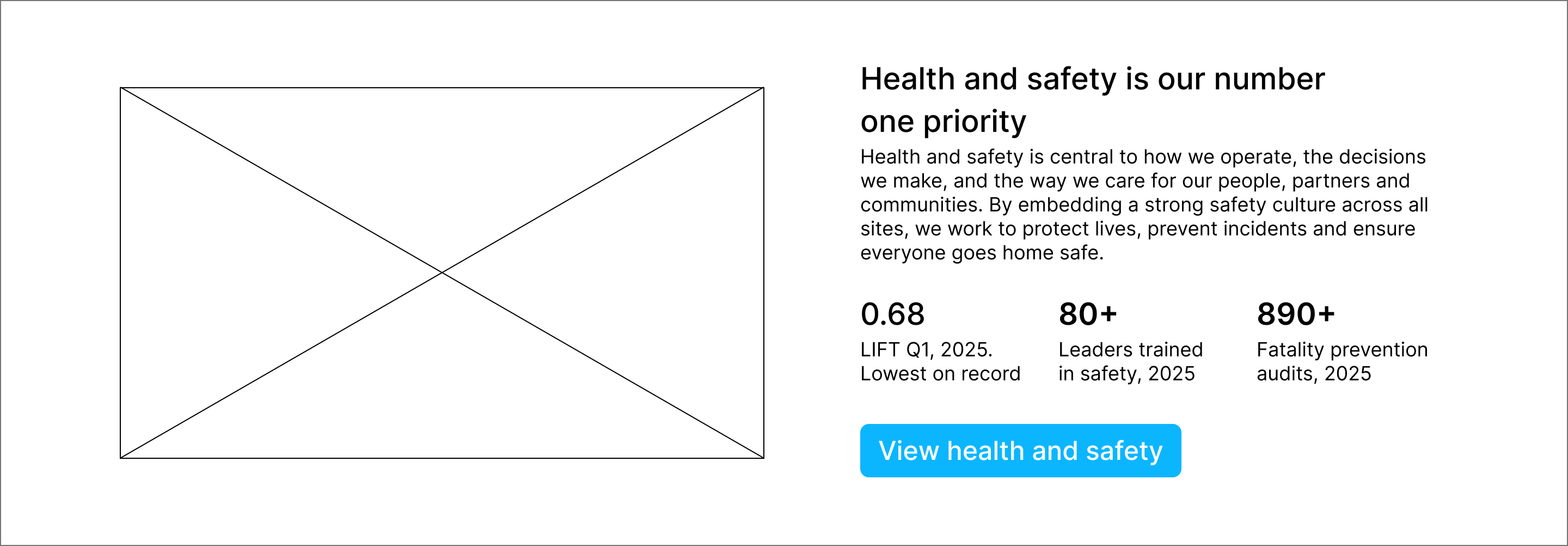
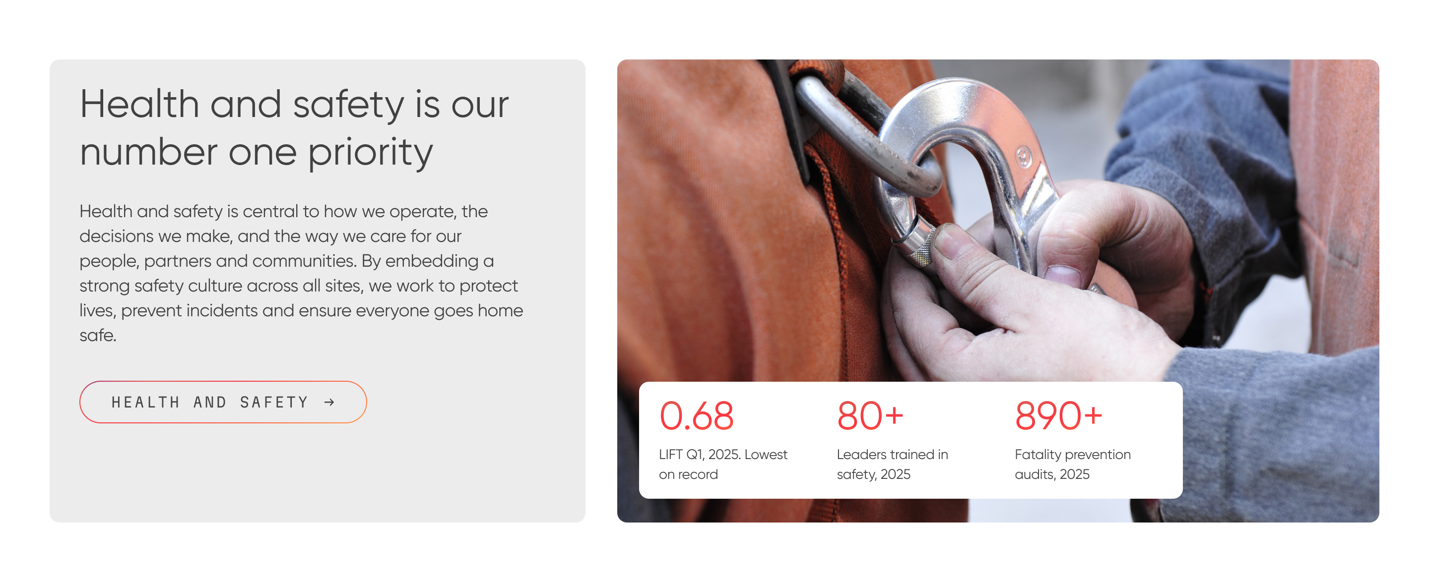
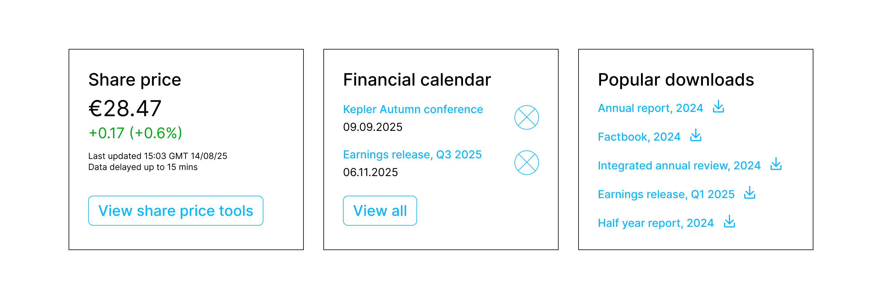
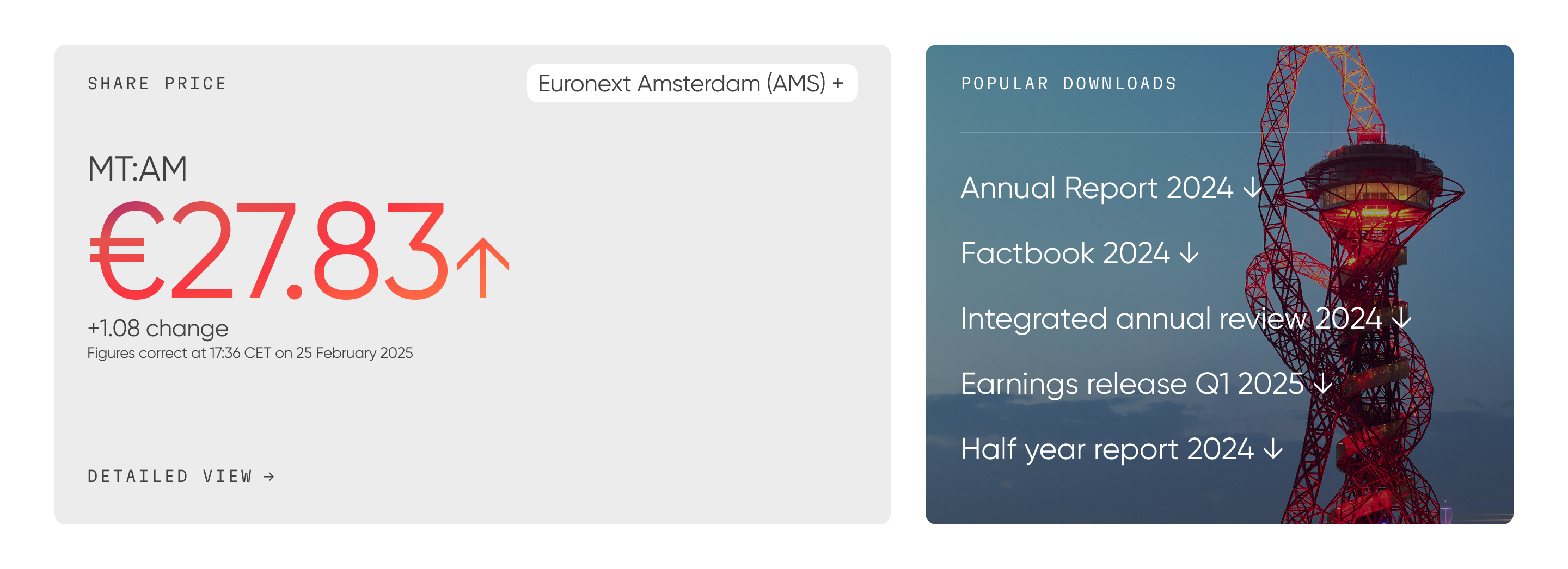
I translated the research into page layouts, navigation behaviour and content hierarchy, giving design and development a clear blueprint grounded in user needs and business priorities. I then worked closely with UI designers as the wireframes were developed into high-fidelity screens.
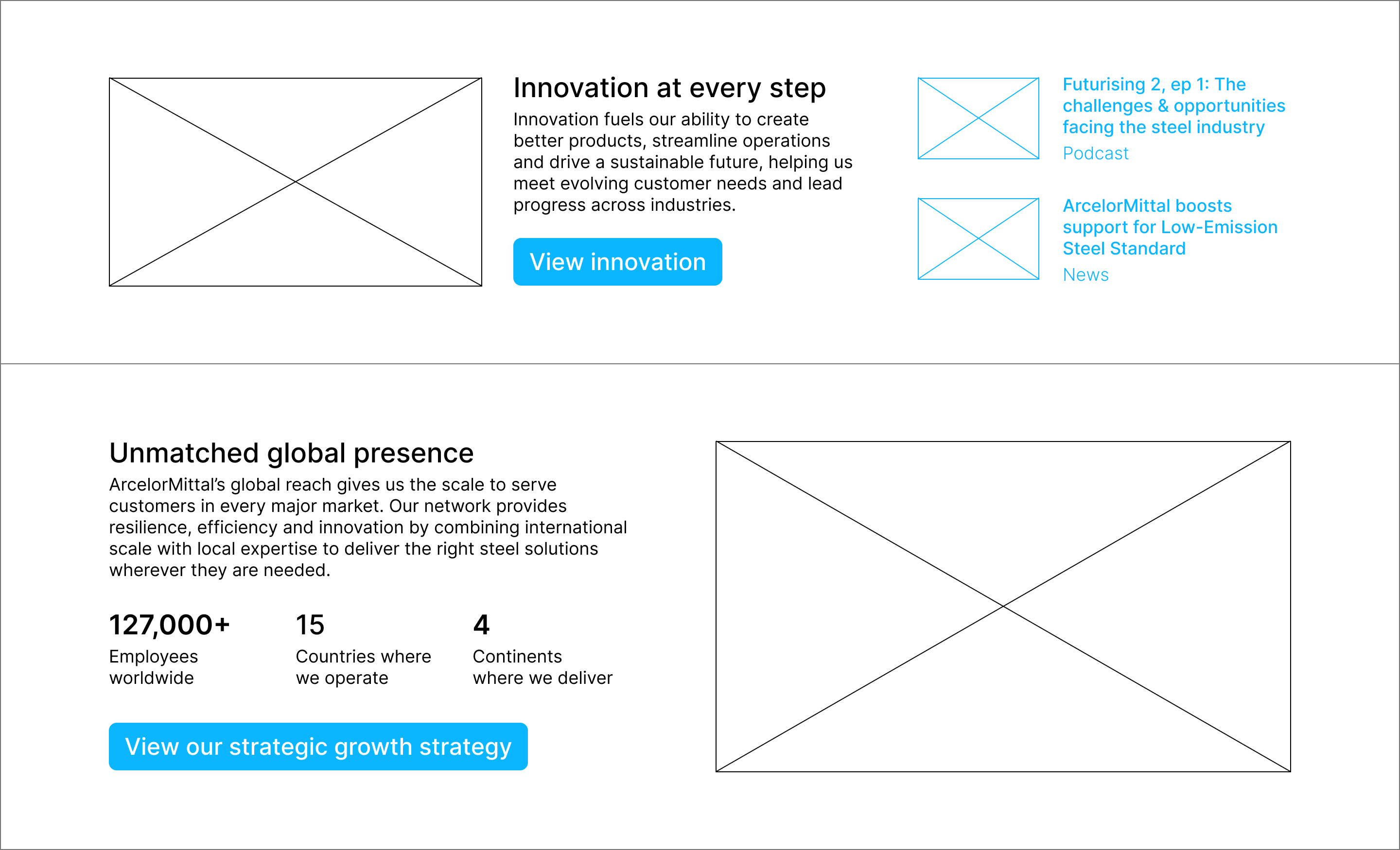
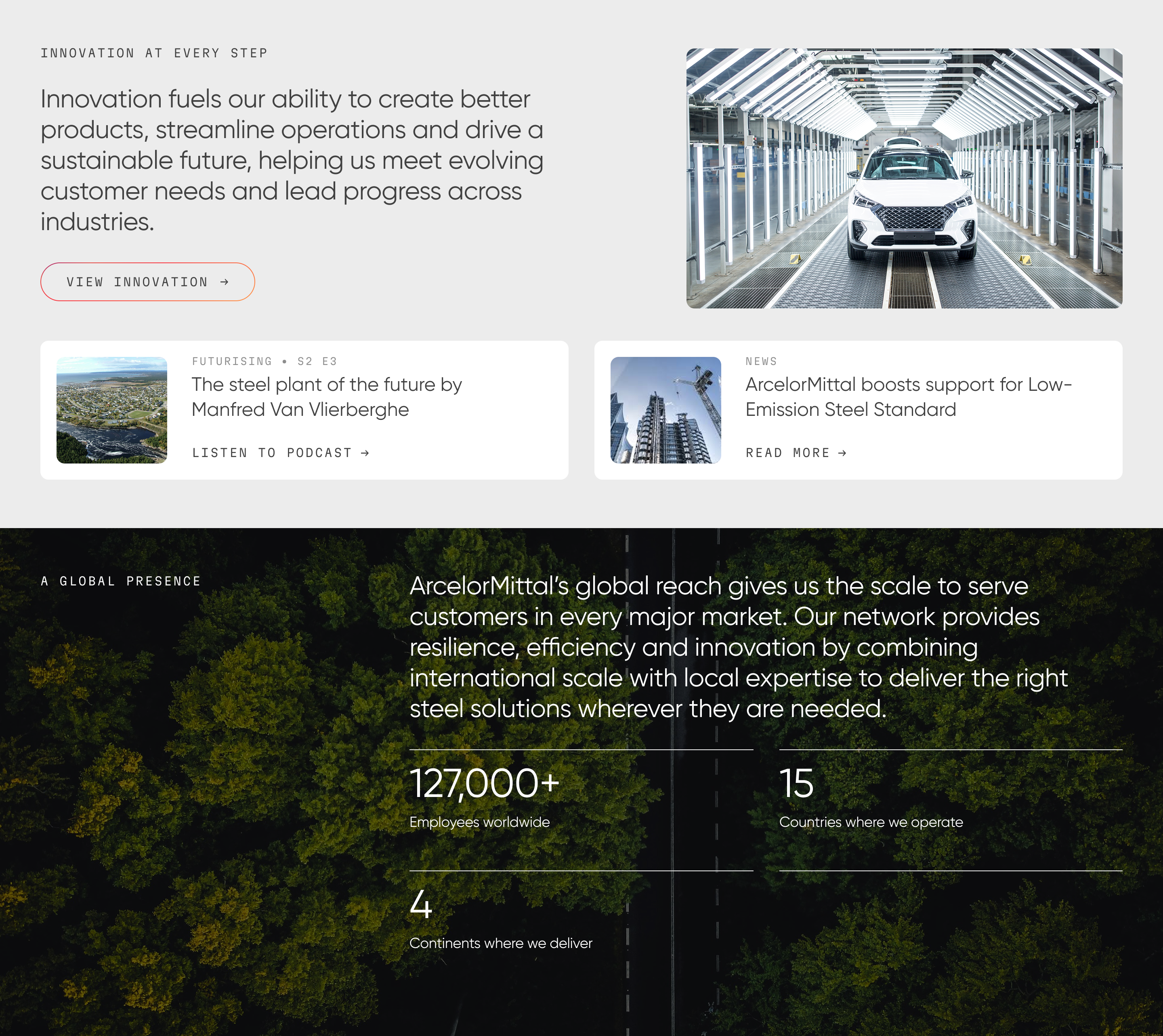
Keeping the UX intent intact through build
I worked closely with designers and engineers through build and launch, helping manage trade-offs and make sure the final delivery stayed true to the user and business needs behind the work.
A clearer, leaner site shaped by research and built to work for users and internal teams.